What is Pantone?
Pantone are undoubtedly experts on colour. They're at the helm of innovative and helpful colour systems and technology that will help you select the right colour - whether you're giving your lounge that feature wall you've always wanted, or creating a new flyer for your organic gardening business.
Philosophy
The latest campaign from Pantone embodies what they're all about. Titled 'Make it Brilliant', it looks into everyday fashion, design and craft, and the endless possibilities of colour.
There are so many avenues you can explore, and with Pantone's 84 new shades as well as all of the old favourites, you are only limited by your imagination when it comes to your graphic design.
Past to present
Pantone was founded by Lawrence Herbert in 1963. Herbert had a great understanding of the spectrum and used this knowledge to find solutions for colour problems. He created a revolutionary system that can help you find and match colours no matter what your need.
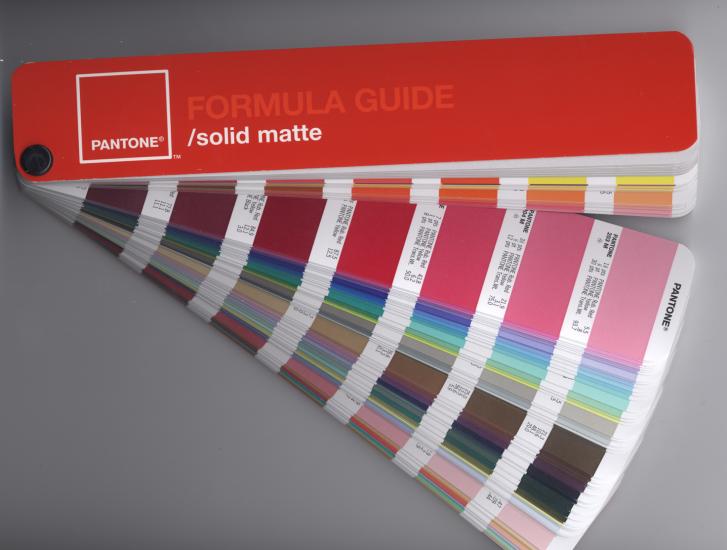
The understanding that every person looks at colours differently led him to create the fan formatted colour book, known as the matching system.
Since these beginnings, Pantone has built on this initial system and started other ventures, including advancements in digital technology, fashion, home, architecture and interiors.
Every year, one specific colour is highlighted. This year Radiant Orchid is in the spotlight. It's calm and quietly bold, the soft colour of blooming orchids. Past colours have included rich Emerald in 2013, fun Tangerine Tango in 2012 and bubbly pink Honeysuckle in 2011.
Graphic art
The Pantone Plus Series is the current version of the matching system and is very helpful for graphic design. It can help when choosing colours for your artwork, including matching them and controlling the ink.
The CMYK Guides have 2,868 colours that can be used with digital printing. There are also guides if you're creating something a little snazzy, and are after metallics, pastels and neon colours.
What are the benefits of using Pantone colours over CMYK?
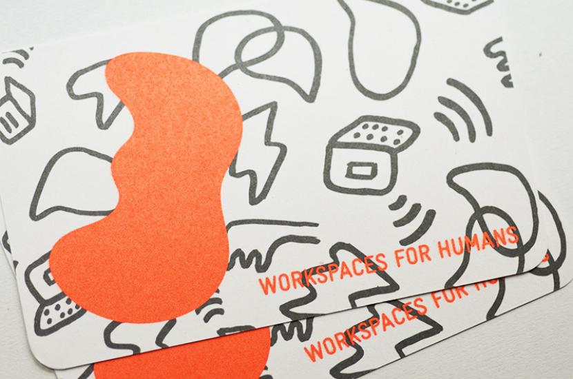 Work Spaces for Humans 2 Pantone colour business card - Designer: Spencer Harrison
Does PrintTogether use Pantone colours?
Yes we do, however we are a collective printer and print multiple jobs together. The chances
of us finding two or more clients who are using the same unique Pantone
colour at the same time on the same paper are very slim. We therefore have to print all Pantone jobs on their own as a custom job. We print a lot of Pantone spot colours for products such as swing tags on our 366gsm raw brown box board.
Can you get Pantone colours in vegetable based inks?
You sure can. PrintTogether only use vegetable based inks for all of our offset jobs, CMYK and Pantone spot colours.To request a quote for a Pantone or CMYK print job visit: www.printtogether.com.au/prices/order/custom
Print Together - online printing service in Melbourne and whole Australia