Understanding colour
Colour: It's what makes up the world around us. We think green and we think grass, trees, and blue can't help but call to mind the expansive sky above us and sea that connects us. At the same time, it's very subjective - purple could mean royalty to one person and fantasy to another.
So how is colour important when it comes to graphic design and how is it utilised? Let's talk colour theory.
Discovering the colour wheel
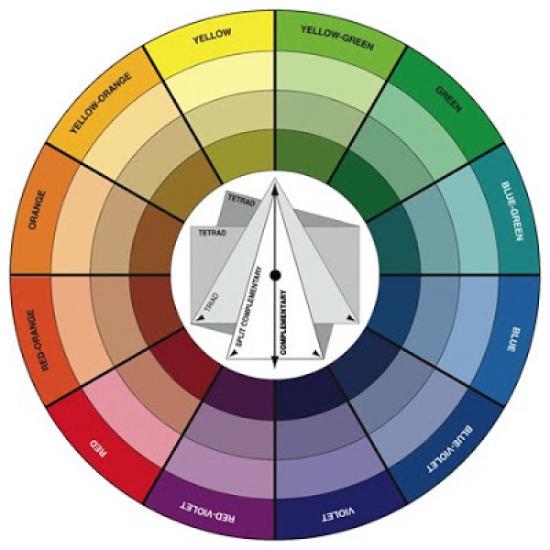
Based on the primary colours of red, yellow and blue, the colour wheel is one of the oldest and most traditional elements of colour theory.
There are three categories of colour - primary, secondary and tertiary. Primary colours are red, yellow and blue. You can mix these three shades in a variety of ways and create all of the others.
Secondary colours consist of mixing two of the primary colours together. Blue and red create purple, with blue and yellow you get green and yellow and red combine to create orange. Tertiary colours are the next layer, so to speak. These are created when a primary and secondary colour are mixed, so you have colours such as blue-green and yellow-orange.
Way back in 1666, Sir Isaac Newton developed a diagram of colours that was the first of its kind. In the years following, there have been a number of scientists and artists who have created their own versions of the colour wheel. With so many to choose from, it really comes down to your own personal preference. Any colour circle that is logical and contains pure hues will work.
Understanding colour context
A colour will look different in relation to another colour. As an example, red can look completely different on a black background as opposed to a white background. In the same vein, the same shade of purple can look more intense or subdued if it is juxtaposed by a dark or light background.
Understanding how this works enables designers to control the brilliance of a colour and how full of life it appears. This is also a starting point for understanding the relativity of colour, saturation, warmth and coolness, and the all important relationships between shades.
Finding colour harmony
Harmony describes a pleasing arrangement, and colour harmony is one of the key aspects of colour theory. When you have colours that are harmonious, it will be infinitely more aesthetically pleasing. At times, two hues are chosen because they do not have harmony with the intention of creating a sensation of chaos or discord. However, more often than not, designers seek to use compatible colours to create an engaging visual that has a sense of order and balance.
The human brain naturally seeks out patterns and familiarity, so often colour harmony can be based on nature. When in doubt, this is a great place to start, as in the natural world there is a variety of surprising and contrasting colour combinations (just think about a parrot, coral reef or sunset).
Other ways to find colour harmony is by basing your choice on analogous colours. This is when you use three colours side by side on the colour wheel - for example green, yellow-green and yellow. In this scheme, often one colour is more dominant.
Complementary colours are those on the opposite side of the colour wheel. This is why red and green and red-purple and yellow-green look good together. This combination provides a great contrast as well as stability.
A monochromatic colour scheme, on the other hand, is based on one colour. The colour can be intensified or made lighter with varying levels of black and white.
Print Together - online printing service in Melbourne and whole Australia