Typography and the role it plays
Never underestimate the power of a good font. Typography and fonts are a crucial part of a design, and here's why.
Developing the look of your brand
Visual culture around the globe is becoming more prominent, with great typography and design making more of an impact with the average consumer.
When you plan your marketing strategy, whether you're advertising a new product or sorting out your business cards, be sure to talk fonts and typography.
A lot of meaning and character can be conveyed in the style of a font - it's a powerful medium! It might help if you think about various fonts and typefaces as having personalities, and finding one that matches the 'personality' of your company. Would you describe your company as bold, vivacious and innovative or green, homemade and personal?
Did you know, in 2009 Tropicana Pure Florida Orange Juice completely re-branded to appeal to a broader market, changing the traditional title to a sans serif look. In just two months, their sales dropped by 20 per cent. This just goes to show the power of branding. It shows the importance of doing it right and creating a look that will withstand the test of time.
What makes good typography?
Good typography will attract and hold the attention of a passerby and instantly project what your company is about. Design conveys a mood or feeling, and your font and typeface is a big part of that. Before your interested third party even starts reading, they can get a feel for what's about to come.
Now, it's important not to get too caught up in the whole typography thing. We get it, there are some beautiful fonts out there and you want to try them all. Take a step back, tone it down a notch, keep it simple. There is power in clean and simple designs, where the font is at once striking and reader-friendly - after all, it's all well and good for you to get someone's attention, but unless they can read it, you've gone to a whole lot of effort for not much point.
Make sure your typography remains consistent - that includes your typefaces, kerning, leading, bullets and formatting. This way, you can build up recognition, so when someone sees your poster, pamphlet, brochure or packaging, they'll instantly think of your company and feel comfortable in that familiarity.
When you decide on a good font, utilise the talents of a graphic designer for strong and effective visual branding so people will be interested and you will likely reap the rewards.
Fonts and typefaces
Fonts, typefaces, what does it all mean? We hear you cry. It's simple, really. If you think about fonts as a family, a typeface would be a member of that family. Typefaces share similar characteristics but are slightly different, and the font refers to the group as a whole.
There are five main fonts.
- Serif is a little bit old school, with flicks or strokes off the letters.
- Sans Serif is a simpler version, with no embellishments.
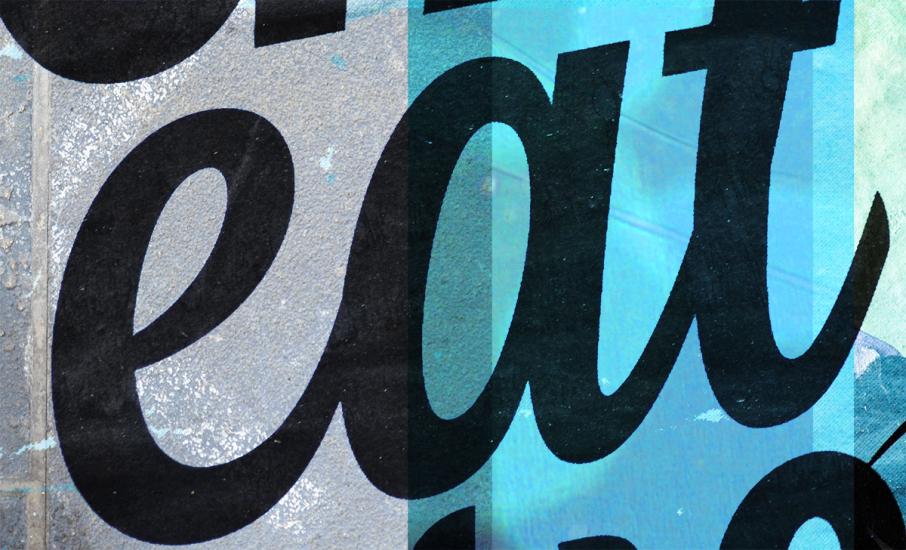
- Script is the kind of font that's reserved for graduation certificates and the like, it's elegant and is best used sparingly.
- Display is the kind of font that's big, bold and demands attention, often used for poster titles.
- Hand Lettering comes in all kinds of styles, but always is made to look as if someone wrote it, with their hand (who would've guessed, with a title like that?).
Resources
A great online resource we use a lot when starting a new design project is Fonts In Use. This website is an independent archive of typography displaying examples of artwork and fonts used. Take a look at: fontsinuse.com
Another interesting read on fonts is an article recently put together by Sex Drugs and Helvetica. They asked 5 designers to give a run down on their go-to typefaces. Well worth a read at: www.sexdrugshelvetica.com/five-typefaces-that-never-let-you-down
Print Together - online printing service in Melbourne and whole Australia